
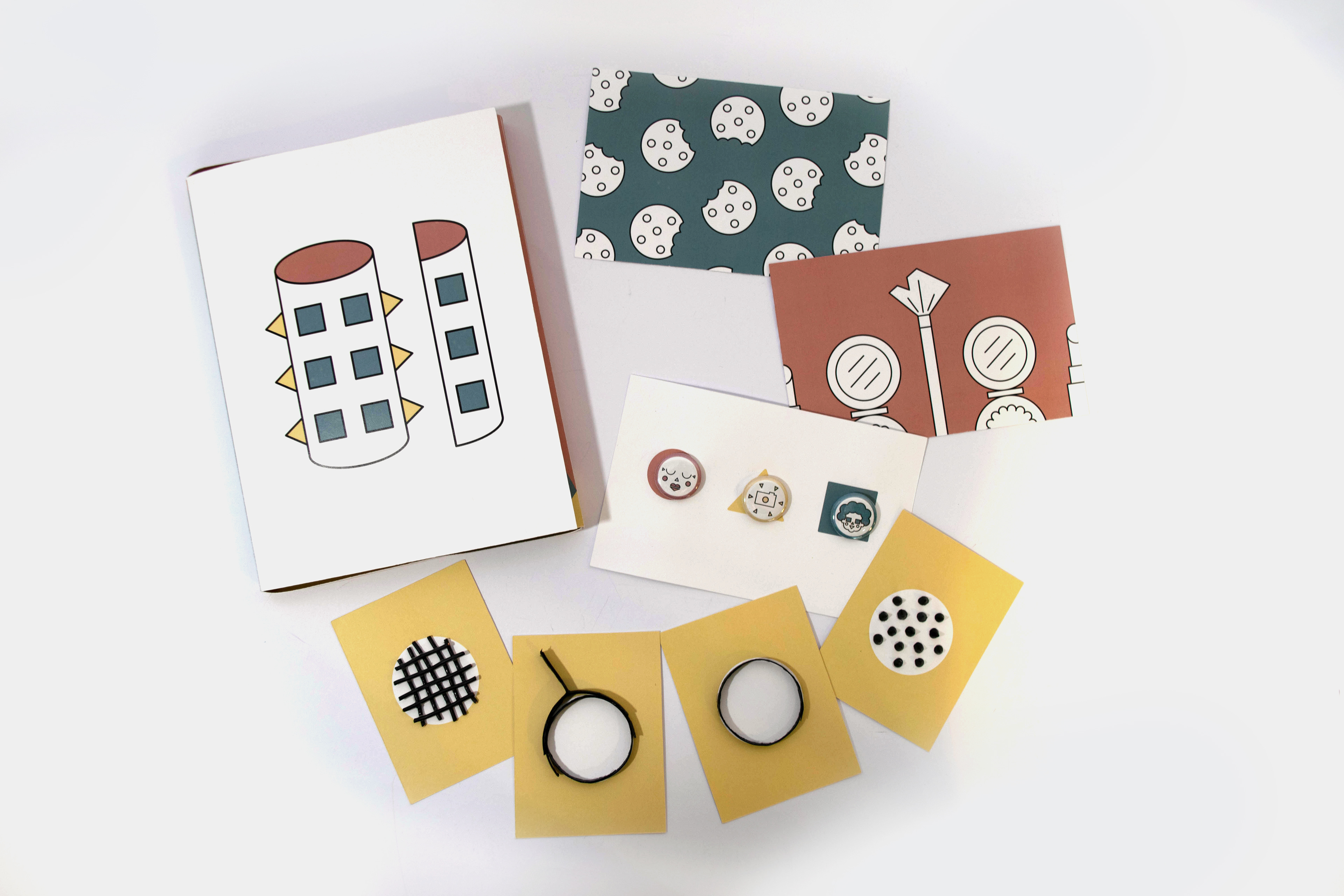
PROJECT DESCRIPTION
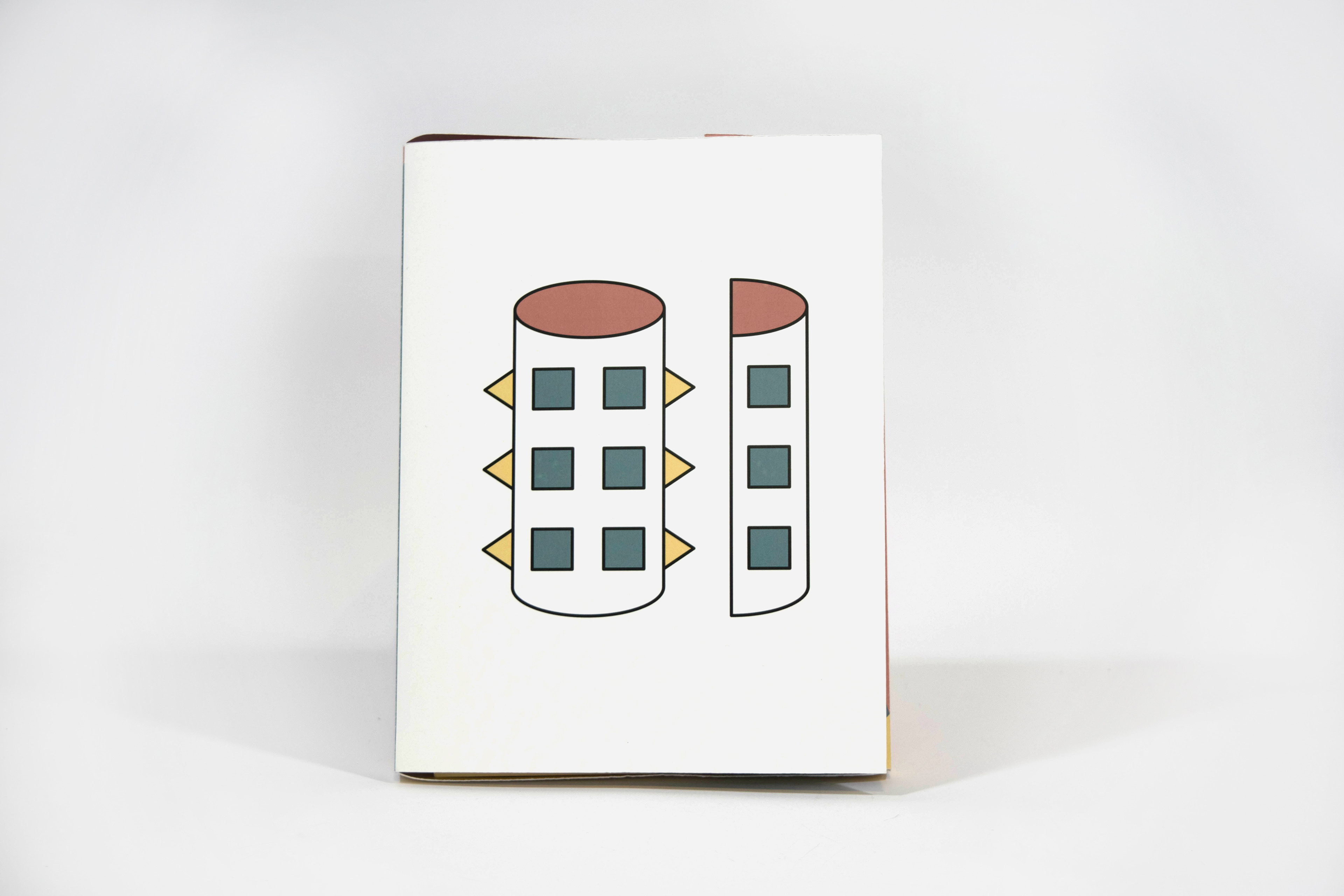
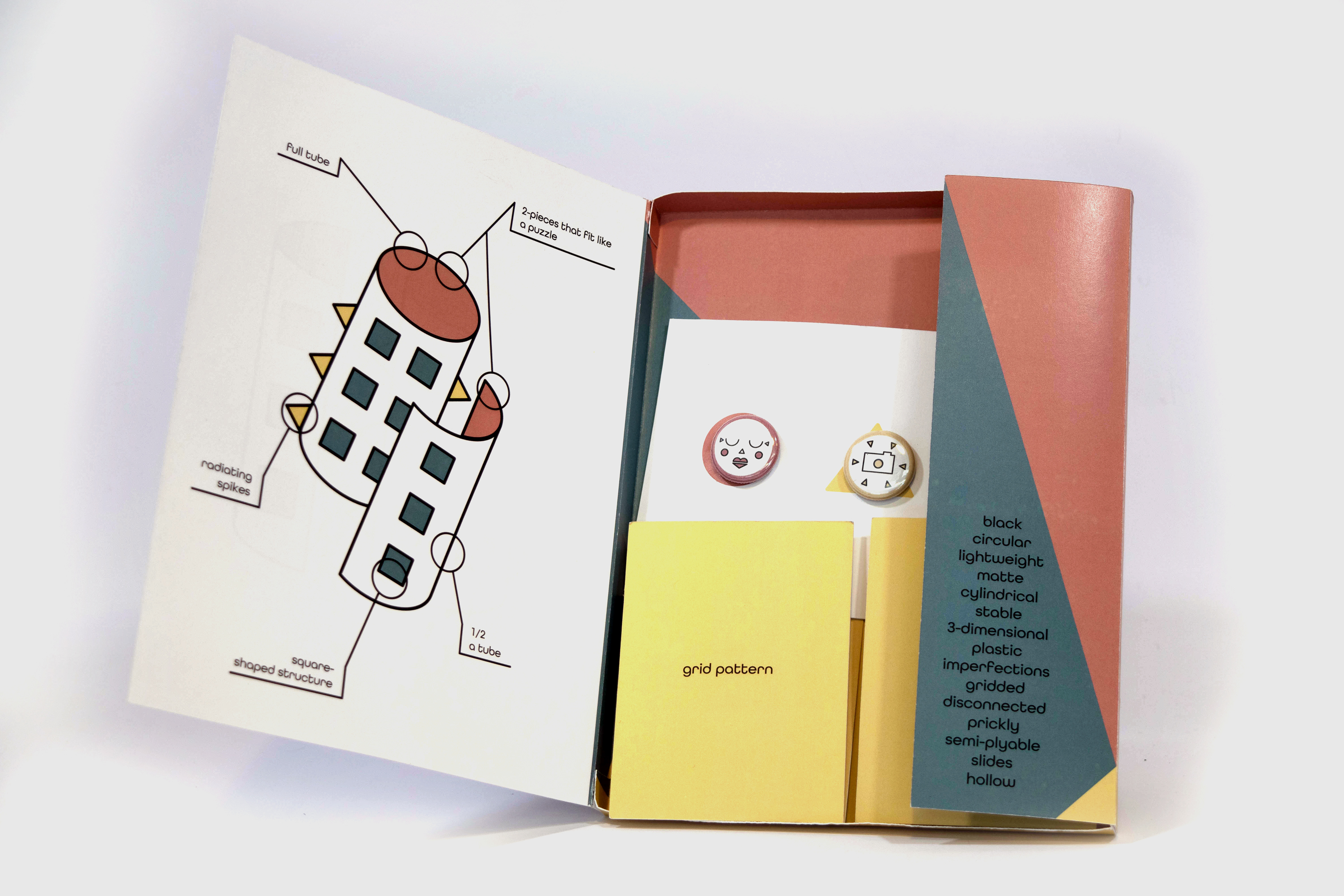
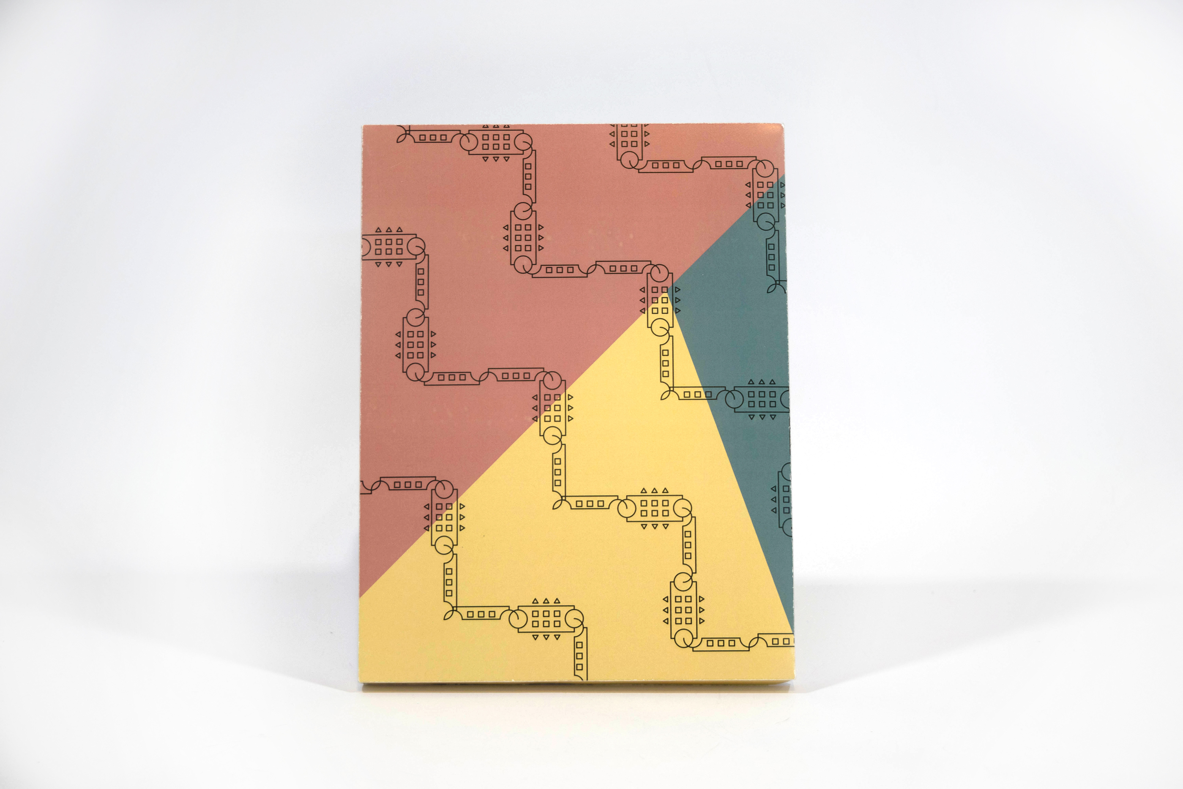
We were given an item for the term for which to then create an “Identikit”. This is essentially a meaningful breakdown of the item, in this case a hair curler, and all the associations and characteristics of it in simple terms. “There are three main parts to this kit -- each part represents a semiotic layer of your object. Together they communicate your object in a way that is dynamic interactive, pragmatic and poetic.” There are 3 layers: concrete outside/inside, recognizable cards, and tangential buttons.

PROCESS
At first, I was overwhelmed. I imagined so many different design directions. I decided to have an overarching design theme to keep the design consistent. I came up with three themes: shapes, lines, and contrast (black and white). While the contrast would be eye-catching, I thought the black and white would get boring after awhile, if not to look at then to create, at least for this project. The lines were interesting, but shapes kept my interest. I thought since most things can be broken down into basic shapes, and I’m essentially deconstructing a hair curler within the kit, I thought shapes would be appropriate. Also, I wanted simplicity in the design so as to not overwhelm the audience. So, even while the kit goes deep, it would still be made up of familiar shapes. Plus, I thought it’d be a fun challenge to create illustrations by only using shapes (circles, squares, triangles).